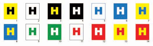
To maximize the effectiveness of your sign, your graphics must be legible. Studies show that contrast plays an important role in legibility. The detail below evaluates various color combinations to help you in your design.
COMPARATIVE VISIBILITY OF COLOR COMBINATIONS
These 14 color combinations for lettering were tested using only primary and secondary colors of full intensity and value.
Tests for readability at a distance were conducted through various advertisers under the sponsorship of the Outdoor Advertising Association of America (OAAA).
The results averaged out in the sequence shown, with #1 being the most legible, moving to #14 as the least legible.
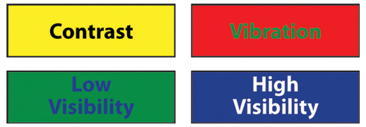
COLOR FREQUENCY AND VIBRATION
Like sound waves, light rays have varying wave lengths or frequencies. The lighter the color, the higher the frequency. These wave lengths determine how we perceive color. Some pigments absorb certain light frequencies and reflect others. We see the reflected frequencies as color.
Complementary colors such as red and green are not readily legible. They have similar black and white value, so their wave lengths set up a vibration. Any combination of colors of similar value, even without vibrating, will have low visibility. However, although yellow and purple are complementary colors, they have strong contrast in value and therefore little vibration. They provide maximum visibility.
FONT SELECTION
When chosing the fonts to use in your signs, focus on legibility and appearance. Having access to a large library of fonts is not a good reason to incorporate mutliple type styles in your sign. Limit the number of fonts, preferably no more than 2. Fonts used should complement one another or your sign will look out of place and unprofessional.
Fonts without serifs are generally easier to read than serifed fonts. The use of script and stylized fonts may add to the apperance of your design but reduce legibility significantly. A stylized font may be suitable for an interior poster, but a poor choice for vehicle graphics where potential customers are mobile and have less time to read your sign.
If your sign may be viewed from a distance, consider a font's characteristics. For example, the font "Impact" is condensed - letters are not as wide as many other fonts. This font is frequently used in signage as it is easy to read and lends itself well to non-proportionate scaling. This allows you to have taller letters in the width available.
With extensive background in typography and graphic design, we can help you chose fonts that present a certain image, and advise on the relative effectiveness of fonts you might be considering.
LETTER SIZING
In designing graphics, a number of factors affect legibility including the size of lettering at a given distance.
Assuming a highly legible font such as Helvetica, using all capital letters and optimal negative space, the chart below is an aid in determining the height of lettering you'll need in order for your sign to be legible from a fixed location.
Letter Height | Distance For Maximum Impact | Maximum Readable Distance |
3 in. | 30 ft. | 100 ft. |
4 in. | 40 ft. | 150 ft. |
6 in. | 60 ft. | 200 ft. |
8 in. | 80 ft. | 350 ft |
9 in. | 90 ft. | 400 ft. |
10 in. | 100 ft. | 450 ft. |
12 in. | 120 ft. | 525 ft. |
15 in. | 150 ft. | 630 ft. |
18 in. | 180 ft. | 750 ft. |
24 in. | 240 ft. | 1,000 ft. |
30 in. | 300 ft. | 1,250 ft. |
36 in. | 360 ft. | 1,500 ft. |
42 in. | 420 ft. | 1,750 ft. |
48 in. | 480 ft. | 2,000 ft. |
54 in. | 540 ft. | 2,250 ft. |
60 in. | 600 ft. | 2,500 ft. |
If the viewer of your sign is not stationary, larger letters will be needed.
We can help you design graphics that are attractive and effective.
Location
Your sign should be installed in a location that is visible without obstruction from any source. Ideally, building signs should be installed as close to the street as possible. When considering sign location, minimize the viewing angle if possible. A sign viewed straight on is more legible than a sign viewed at an angle. As an extreme example, consider a sign installed parallel to a road. It's most legible when drivers are closest to the sign, but the sign would be at a 90 degree right angle to the driver. Hopefully, drivers aren't looking out the passenger window trying to read your sign. Besides being unsafe, they wouldn't have long to read your sign.
Lighting affects contrast. Try to avoid having your sign installed where it may be in shadow during peak business hours.
Credit: The United States Sign Council (USSC)